Back to Work

Healthcare . Brand Sprint

Radiologie Ahrensburg

Radiologie Ahrensburg brand identity — logo and visual system

Client

Radiologie Ahrensburg

Role

Brand Designer

Year

2025

Scope

Brand Sprint (10 weeks)

A 60-year-old practice. No logo. Corporate competition moving in.

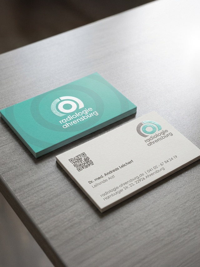
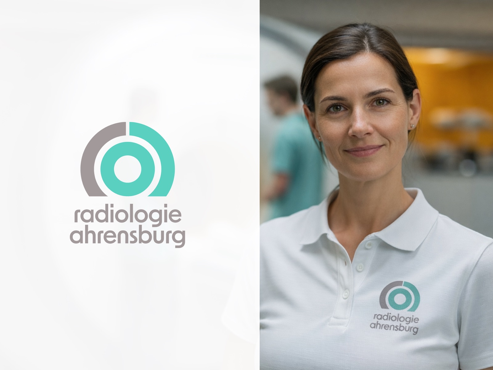
Radiologie Ahrensburg has been part of the community since 1965. Run directly by its two owner-physicians — Priv.-Doz. Dr. med. Vera Schreiter and Dr. med. Andreas Leichert — it's a practice built on personal accountability: both doctors present every day, reachable, responsible for every scan that leaves the building.

But it had no visual identity to speak of. No logo. No consistent presence. Nothing that communicated six decades of expertise and the human practice behind it. The timing made this urgent: Radiologische Allianz — one of Germany's largest corporate radiology networks — was expanding into Ahrensburg. The practice needed to compete, and compete visibly.

The advantage was there. The brand just needed to say it.

In partnership with Steen Digital, the Brand Sprint began with a workshop with both owners. What surfaced quickly was the practice's real differentiator: in a market consolidating into corporate networks where doctors rotate and ownership is remote, Radiologie Ahrensburg offers something rare. As Dr. Leichert put it: "We are an owner-based little company, and the immediate possibility to get in touch with us and to solve problems is a big advantage."

That truth became the foundation. The visual identity draws from the practice's own instruments — the concentric rings of a radiology scan — rendered in warm teal and soft grey with a rounded lowercase wordmark. Technically precise, genuinely approachable. The system's guiding line: Moderne Bildgebung, menschlich umgesetzt.

We are an owner-based little company, and the immediate possibility to get in touch with us and to solve problems is a big advantage.

— Dr. Andreas Leichert, Leitender Arzt, Radiologie Ahrensburg

From no identity to a complete brand system — in ten weeks.

Starting from nothing, the sprint delivered a full visual identity: logo, colour system, typography, and a 54-page brand guide. Then the system came to life — business cards for both owner-physicians, staff uniforms, a 3D clinic plaque, and a bilingual one-page website with integrated 24h online appointment booking via Doctolib.

The practice launched with everything it needed to compete with the corporate networks moving into their territory — and with a brand that reflects exactly what they are: a human practice, built on personal expertise, with sixty years behind it.

Impact

Built from scratch. Delivered in full.

1965

The practice's founding year — and the first time it has a brand to match its history

10 weeks

From opening workshop to brand guide, website, signage, uniforms, and full rollout

6

Deliverables: logo & brand guide, website, business cards, clinic plaque, uniforms, Doctolib integration

They Fight With Cameras LM Alltagshilfe

Start a Project

Ready to give your brand a shape?

Get in Touch